AccessCORPS
AccessCORPS is a vertically integrated project (VIP) at the Georgia Institute of Technology comprised of students and faculty. It is focused on evaluating, remediating, and researching to make classes more inclusive.
Duration
Oct. - Nov. 2023
Teammate
Nikkolas Glover (he/him)
My Role
New Landing Page Layout
Banner Graphic
Tools
Figma
Overview
Project Goals
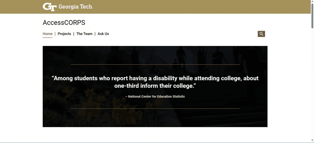
Redesign the AccessCORPS landing page to follow Georgia Tech’s branding and to demonstrate a connection with our partner organizations.
Approach
Before the Fall of 2023, I was looking to join AccessCORPS, a VIP at Georgia Tech dedicated toward improving accessibility in classroom settings. From the current website I didn't have a great sense of how this organization was connected to Georgia Tech and other organizations. In fact, during class I once suggested that our VIP try to gain ties with an organization on campus called the Center for Inclusive Design and Innovation, only to learn that we were already working with them along with the Office of Disability Services.
As soon as we were allowed to join sub teams in the VIP, I signed up for the Outreach Team as I knew one of their main focuses for the semester was website redesign.
I was determined to leverage my design skills to create a clear connection between AccessCORPS, Georgia Tech, and AccessCORPS's partners while also further developing AccessCORPS's branding to more clearly showcase the organization's purpose.
Research
Georgia Tech Brand Identity Guide
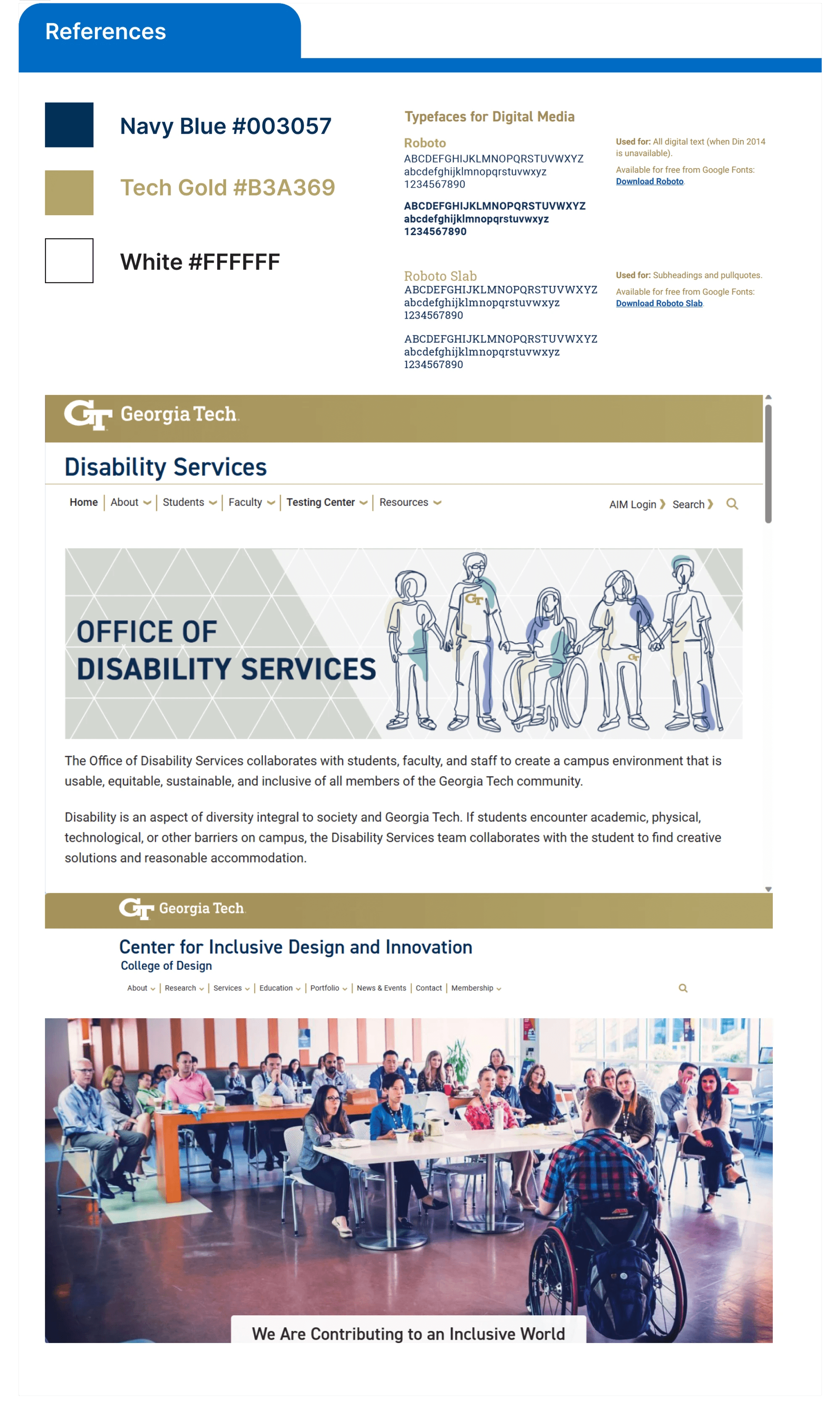
I first began by reviewing Georgia Tech’s Brand Identity Guide and various Georgia Tech websites to identify primary colors, typefaces, and layouts used.
Among the website I reviewed, I specifically sought out the websites of AccessCORPS’s partners to create a sense of unity amongst our landing page layouts.
Design
Wireframes
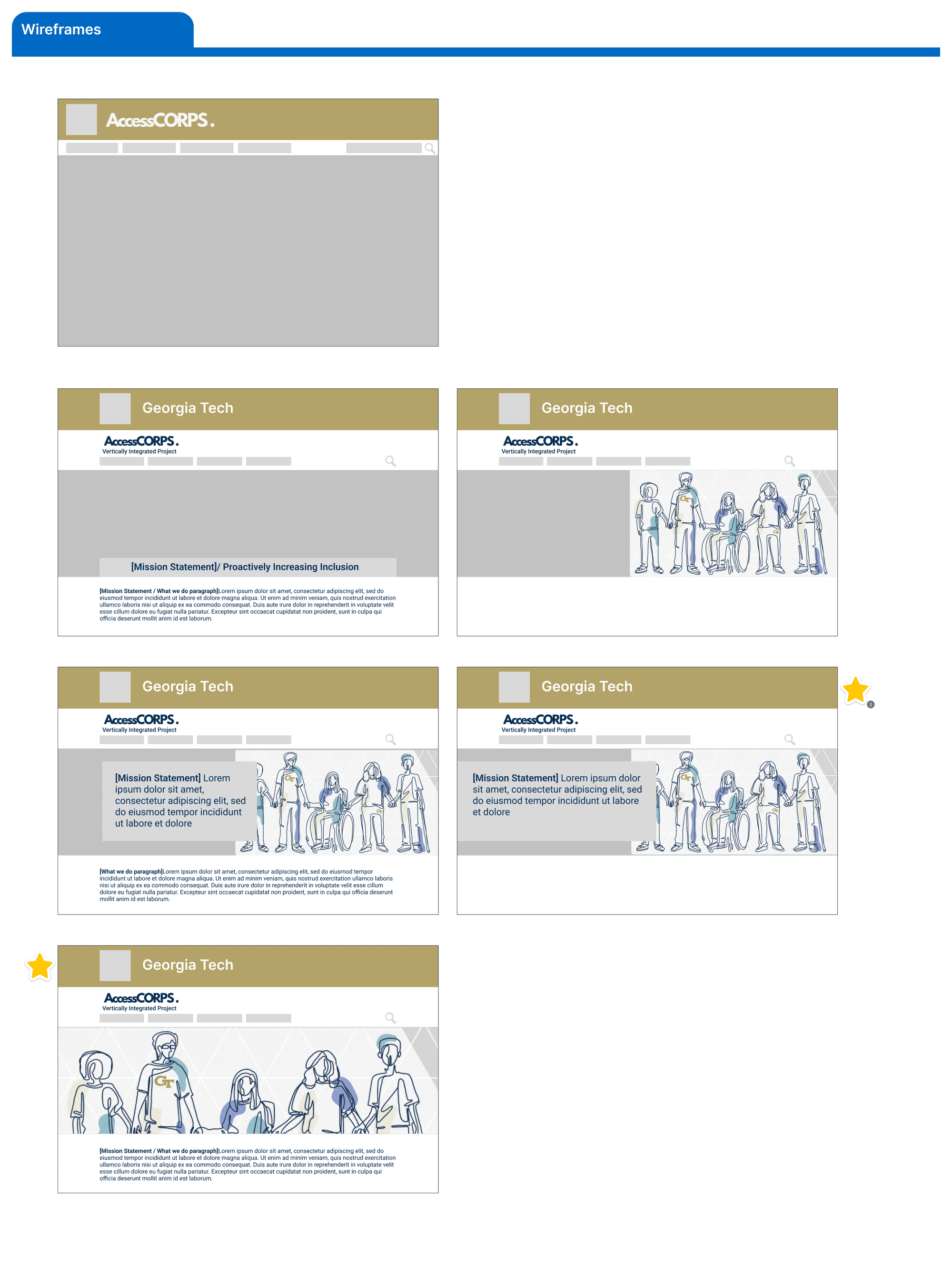
I developed a few wireframes with layouts inspired by the landing pages of our partner organizations. From this inspiration I made specific note of how much visual weight and information could be conveyed by an image, but also acknowledged that this information should be accompanied by text to support the image, or in the case for some users with visual impairments, as the main source of insight on the VIP's purpose.
Within a few of the designs is a placeholder image of the Georgia Tech Office of Disability landing page banner. I had proposed that we design a banner in a similar art style to their banner to continue promoting our partnership and received positive feedback on this idea.
Landing Page Banner
When approaching the landing page's banner, I initially had critiqued the original website's landing page banner as it wasn't specific in describing the purpose of the organization. While it is true our organization has a focus on accessibility, our remediations focus more on the technology aspect in terms of how students are able to access information from their instructors. These remediations often focus more on resolving barriers for people with cognitive and visual disabilities.
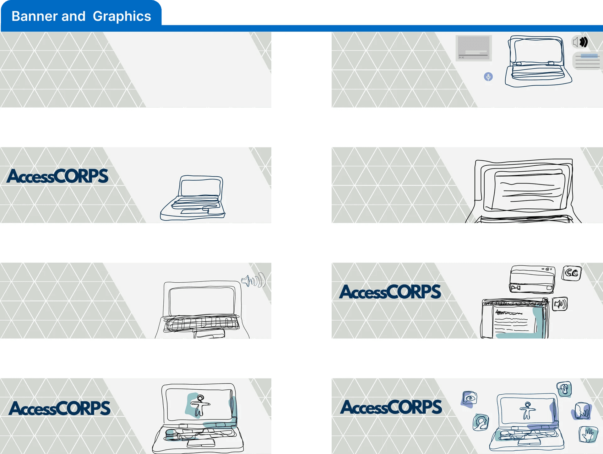
To both point people to our electronic resources-based remediation and further connect us with our partner organization, Georgia Tech's Office of Disability Services, I iterated through new banner designs. I proposed creating a new landing page banner that would be more representative of our organization and would showcase our partnership through similar art styles.
Brainstorming
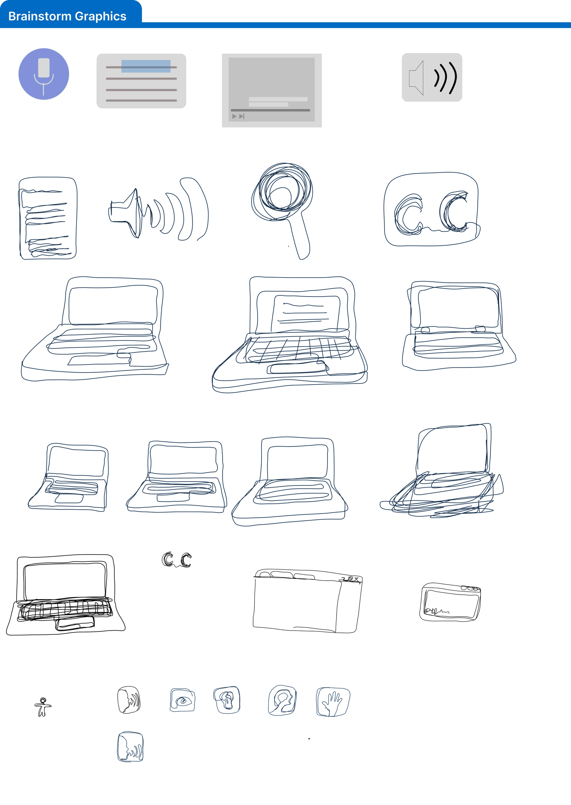
Within the brainstorming stage, I determined that one way to capture the purpose of our organization was by presenting different accessible and assistive technology. I looked at different images online for inspiration and generated a list of common ones I found as well as some I came across from personal experience.
Design
I then created multiple drawings of representations of these technologies.
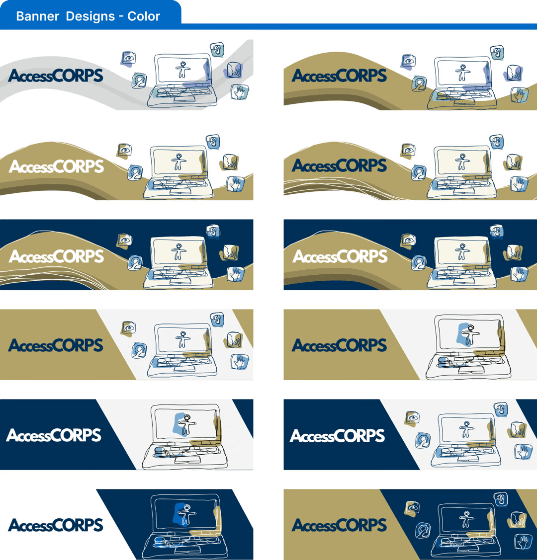
Many of the drawings were iterations of a laptop as AccessCORPS focuses on making digital resources accessible to students and this could be represented in this way.
Continue creating new iterations with the last two designs
The art style works well and graphical elements feel representative of what we do
The grid pattern is distracting and makes it difficult to center the AccessCORPS logo
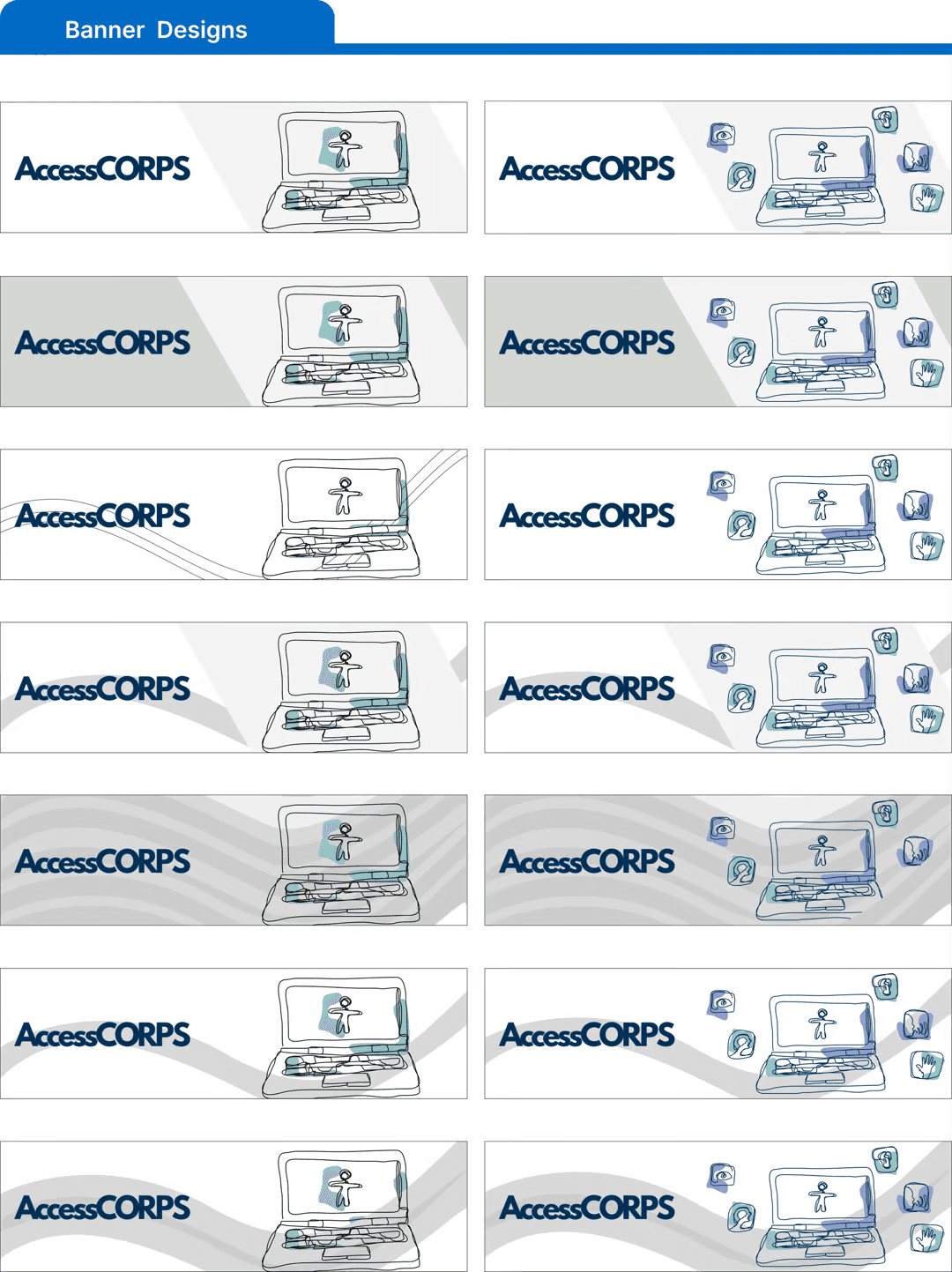
Based on feedback I worked on creating variations of backgrounds. Initially I created simplified versions of the previous ones, but then I began adding curves within the design to give it a more dynamic feeling to it. I feel this better matched the purpose of our organization as we are always working toward improvement rather than allowing the level of accessibility of materials to remain static.
- Continue creating new iterations with the first two designs.
- Can continue creating iterations of the curved designs as they dynamic nature works but isn’t as fully established as it could be.
- Add the Georgia Tech brand colors to designs.
- The purple and light blue on the smaller icons from ODS’s color palette doesn’t go well with the Georgia Tech brand colors so also look for alternate colors.
- Advisors are a fan of the dynamic motion of the curved designs
- The logo needs to be edited as the current ones kerning, (more specifically on the ‘Access’ portion) is difficult to read (let logo designer know)
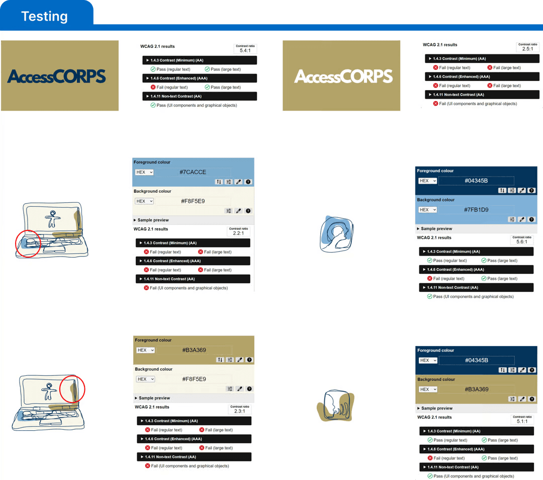
- Contrast needs to be fixed for white text on gold or an outlined needs to be added to improve legibility
To determine an appropriate color contrast, I used a Color Contrast Analyzer. I specifically paid attention to the Contrast Enhanced (large text) and Non-Text Contrast tests.
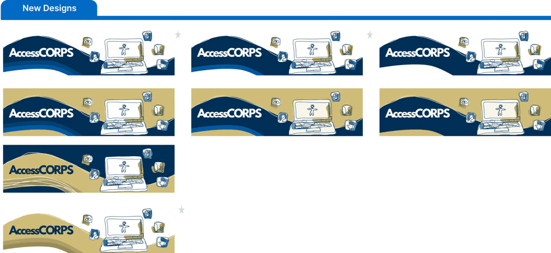
- Colors are much more vibrant.
- The first and last design feel the cleanest.
- The sketched squiggly lines only work well if there are multiple, singular ones feel accidental.
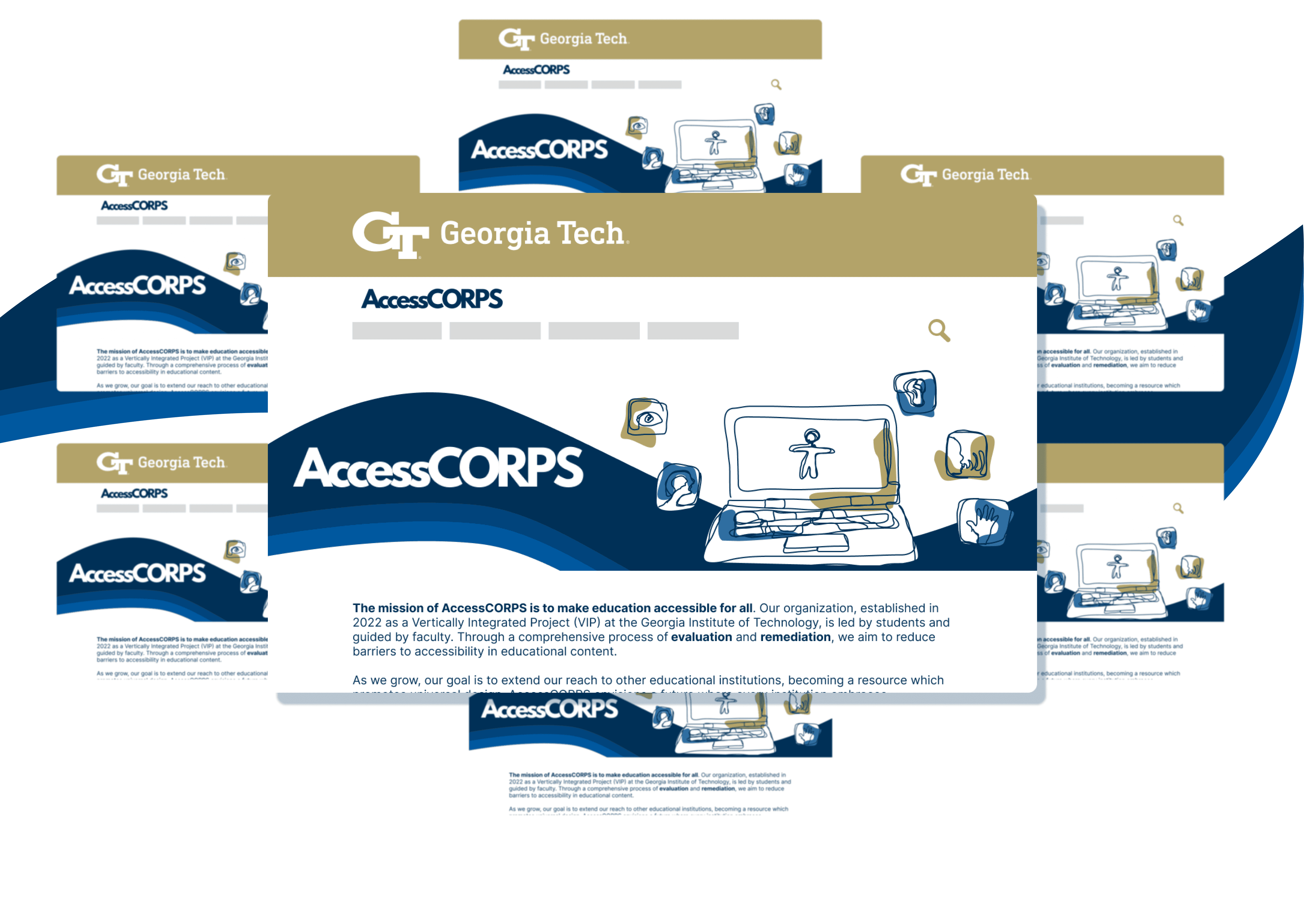
In the final stage of designs, I omitted the single drawn line found on the design and opted to go for variations with the varying shades of colors for added depth of the graphical element. I then placed them into one of the mockups to show them within the context of where they would appear.
Final Banner Design
Reflection
What I Learned:
In Progress!
Areas for Improvement:
In Progress
Final Thoughts
In Progress

