Pluto
Pluto is a speculative company determined to empower individuals to create a safe digital environment for themselves and promote an inclusive and equal web experience for all people regardless of disability.
Duration
Oct. - Dec. 2022
Teammate
Zarya Ajasin (they/them)
My Role
Case Study
Logo Design
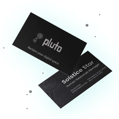
Business Card Design
Website Landing Page Design
Merchandise
Tools
Figma
Adobe Illustrator
Adobe InDesign
Adobe Photoshop
Overview
Project Goals
Combined the design skills gained through a Principles of Visual Design course to create a brand style guide outlining a speculative company's brand colors, typography, logo, website and marketing collateral tailored to a specific user group.
Approach
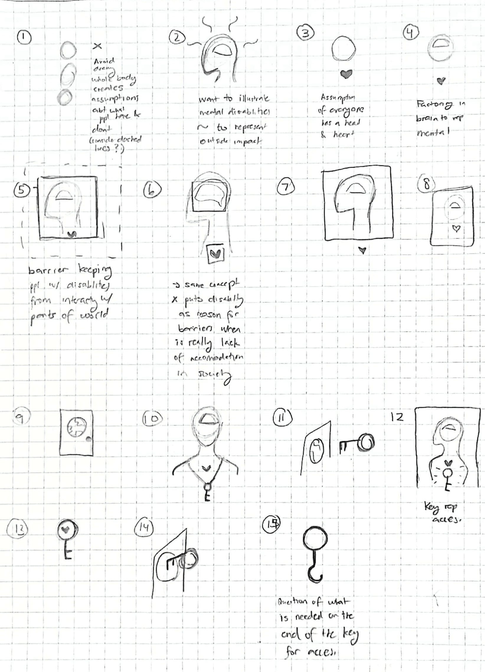
One design that’s always bothered me is the International Symbol of Access (ISA): a simple blue square with a white image of a person sitting in a wheelchair. This symbol is meant to represent areas where accessibility has been improved for people with disabilities, however the design doesn't feel inclusive of people with mental and/or physical disabilities that don’t require the use of a wheelchair.
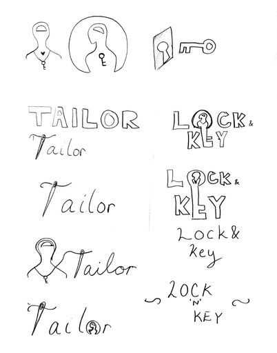
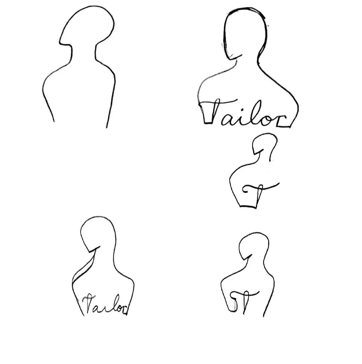
Over the summer of 2022, I took it upon myself to play around with redesigning the symbol. On my desk lay a simple piece of paper with various iterations of new designs that would remain there until the introduction of this project!
Through this project, I got the chance to expand on my previous exploration by developing the brand for Pluto: a company empowering individuals to create a safe digital environment for themselves and promote an inclusive and equal web experience for all people regardless of disability.
Research
Case Study - Brand Identity Prism
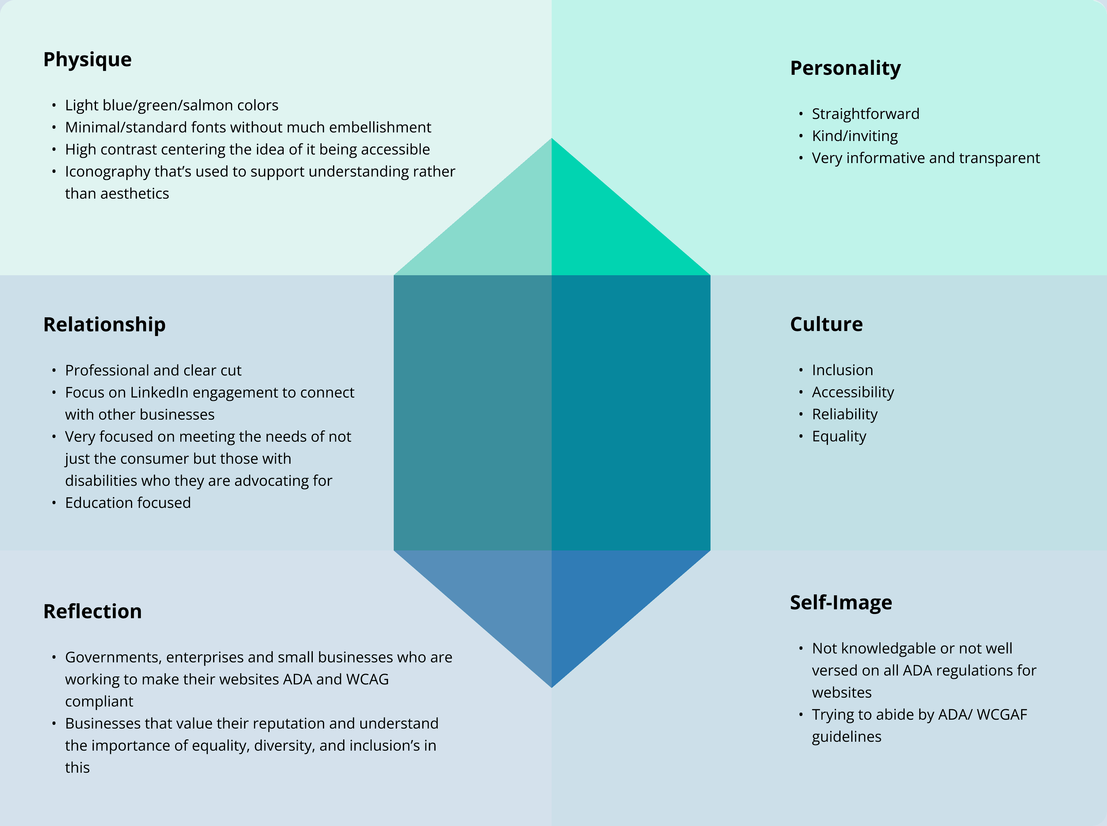
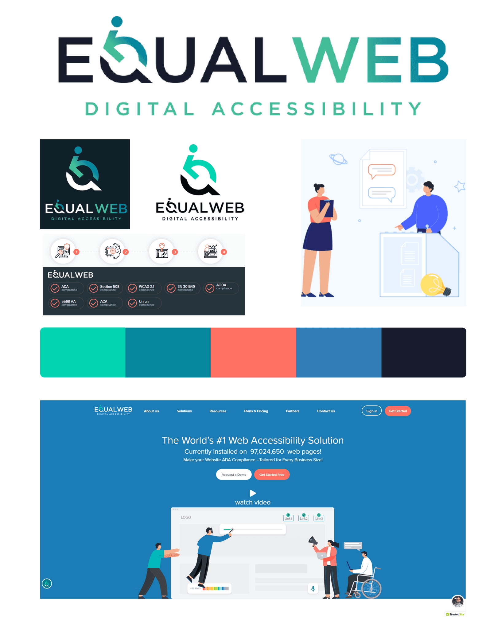
After agreeing that our speculative company would have a focus on accessibility, my partner and I searched for companies that offered services in this area and found Equal Web. We compiled assets from the company’s website and analyzed its mission statement and visual & typographic elements through the lens of a Brand Identity Prism.
Equal Web Mission Statment:
To promote an inclusive and equal Web experience for all people, regardless of disability. To help its customers attain equal access to everyone at a cost-effective and seamless browsing experience, providing the invaluable care-free assurance of litigation avoidance—making everyone a lot happier in the process.
Takeaways: Making it Our Own
While both of our company's had a focus on accessibility, our companies differed when it came to who our consumers were.
Equal Web's consumers are governments, enterprises and small businesses who are were trying to make their websites ADA and WCAG compliant whereas our consumers are individuals with disabilities that aren't always accounted for in online spaces.
We saw that this difference impacted the 'Relationship', 'Reflection', and 'Self-Image' areas of the Brand Identity Prism and would influence how our brand would be formed, branching away from Equal Web's branding.
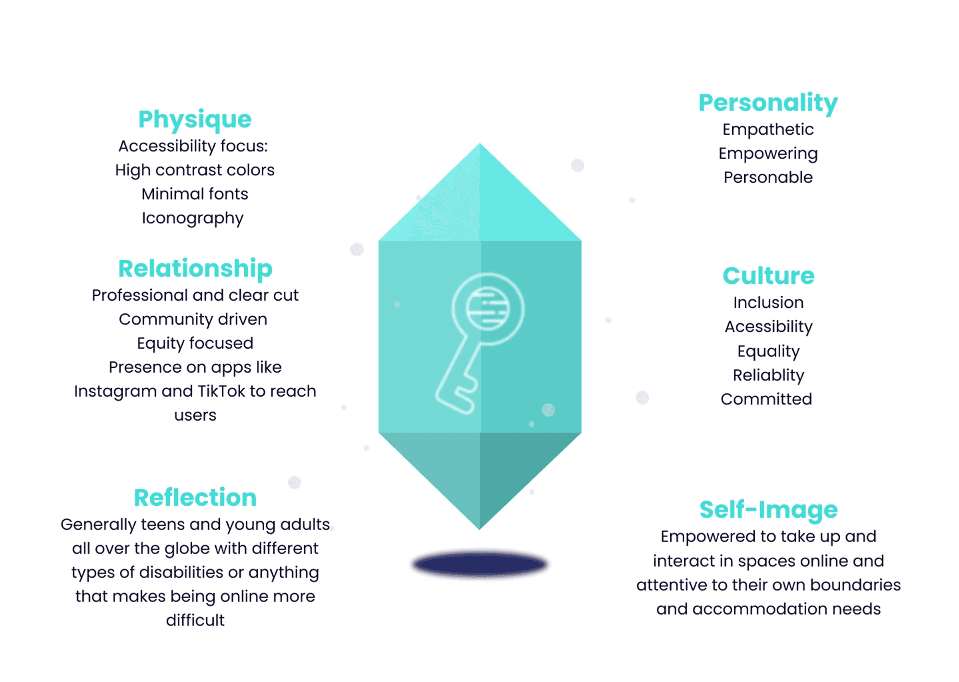
From this case study, we pulled out the aspects of Equal Web that still aligned with our company and developed our own mission statement and brand identity prism to showcase those aspects.
Our Web Mission Statement:
To empower individuals to create a safe digital environment for themselves and promote an inclusive and equal web experience for all people regardless of disability.
Design
Logo
The initial designs started with one of the iterations from my previous attempts at redesigning the ISA. This design had three main components, each representing the following:
Component
Meaning
Key
Access
Silhouette of Body
Physical Disability
Silhouette of Mind
Mental Disability
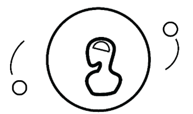
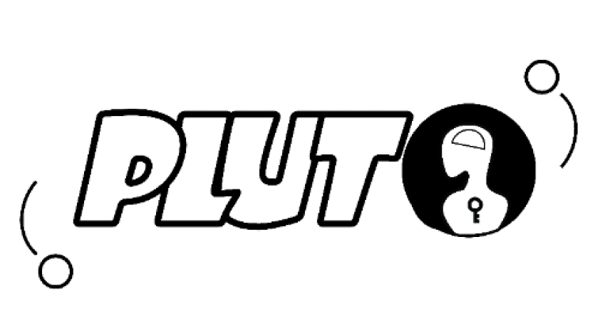
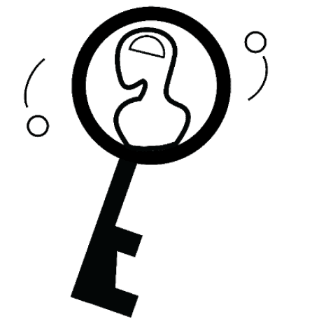
These iterations focused on figuring out how best to arrange our 3 main pieces of iconography: the key, the planet, and the silhouette of the body.
With this design we faced an issue: the design was too busy, steering away from our goals of simple iconography, as well as posing an issue of legibility when the design was looked at from a far. To address this question we asked ourselves:
What parts of the logo are absolutely necessary in conveying our company's mission to our users?
Revisiting our mission statement, we determined that in creating an inclusive and equal web experience for all people regardless of disability, our main focus was on access, which was represented by the key. This became a constant within our designs as we moved forward, ultimately leading to our final logo designs.
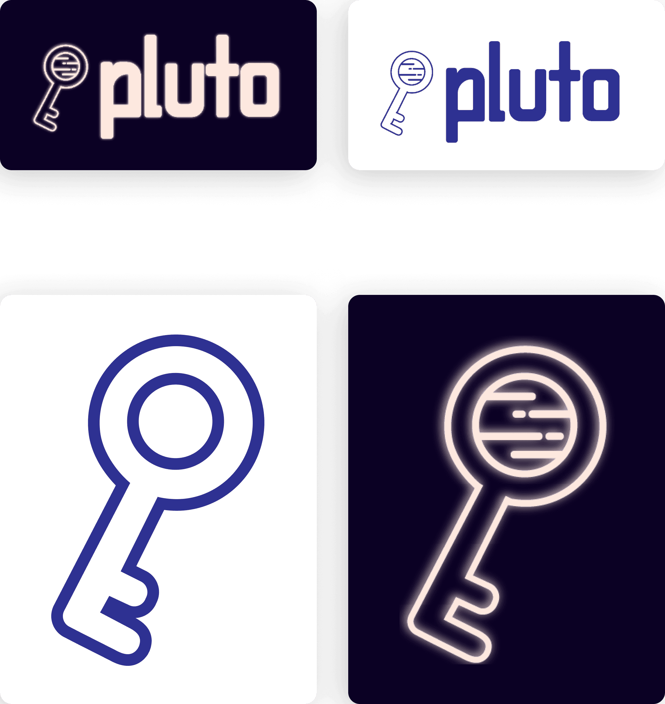
Color icon sans detailing for small icon use.
White glowing icon with detailing for large uses.
White wordmark + icon for use on dark backgrounds
Purple wordmark + icon for use on light backgrounds
Business Card
The main problem with creating the business cards was that they were being developed at the same time as our logo and with colors that were still being decided on, but later in the design process were changed. The uncertainty of the elements made them difficult to design with because they weren't very cohesive design choices.
I had tried to integrate the various elements of a design featuring two keys as well as play into the space theme our design had adopted, however the results weren't visually appealing.
Some feedback we received noted that "given the central symmetry of the keys, the italicized PLUTO text looks like it is either not centered or too large." In addition, we personally believed the design to be a bit busy and that our turquoise accent color was being misused on the main logo's keys and the background stars, detracting from the actual content.
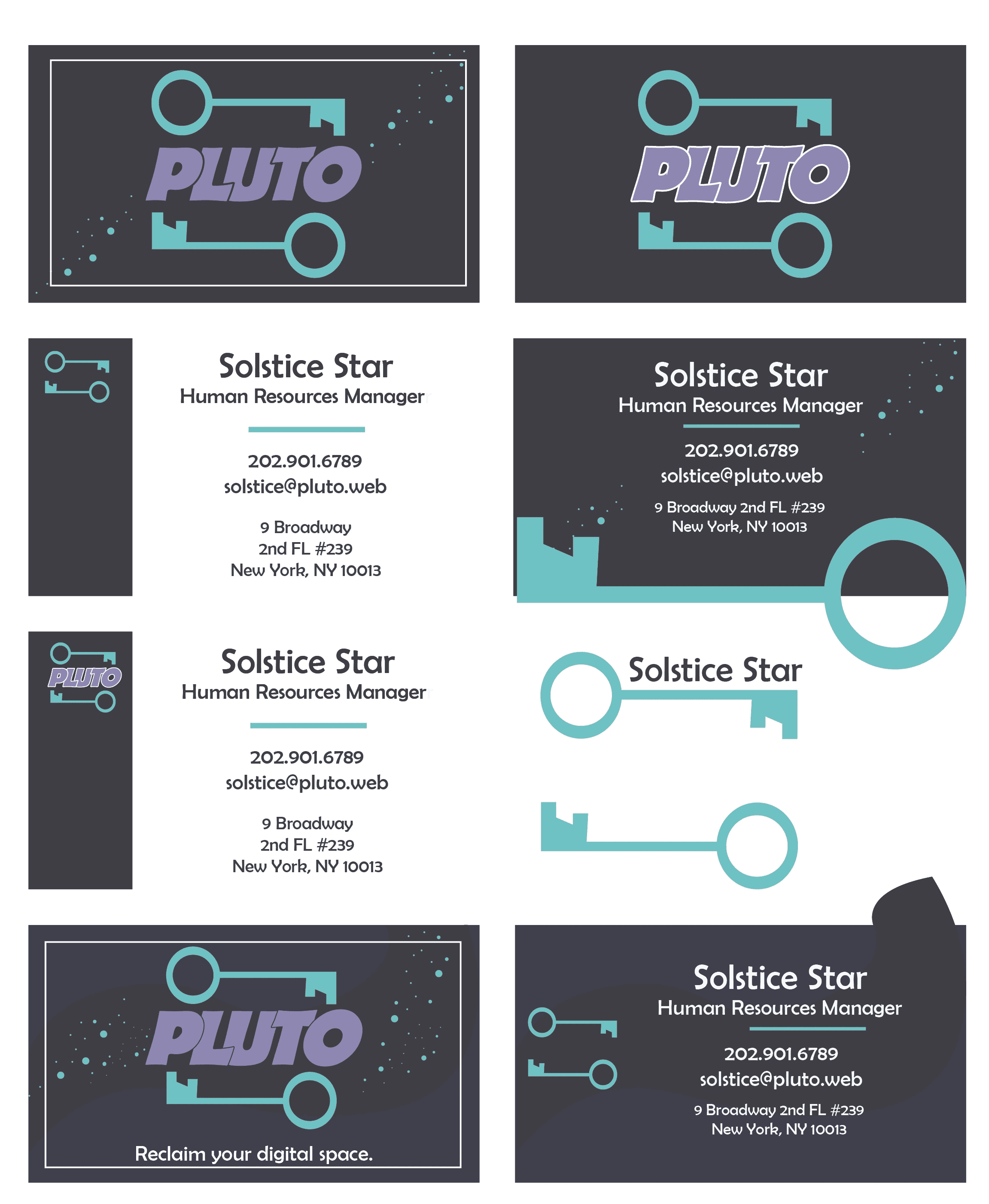
To combat these issues, we simplified our logo, using only one key to allow the design more room to breathe. With the extra space created, I added our company's catchphrase : "Reclaim your digital space" to give people an idea of what the company does. I also omitted the circles previously representing stars to make the focus of the business card be the actual information on it. Based on the colors we chose, I also chose to continue with a darker background for the overall card design.
Landing Page
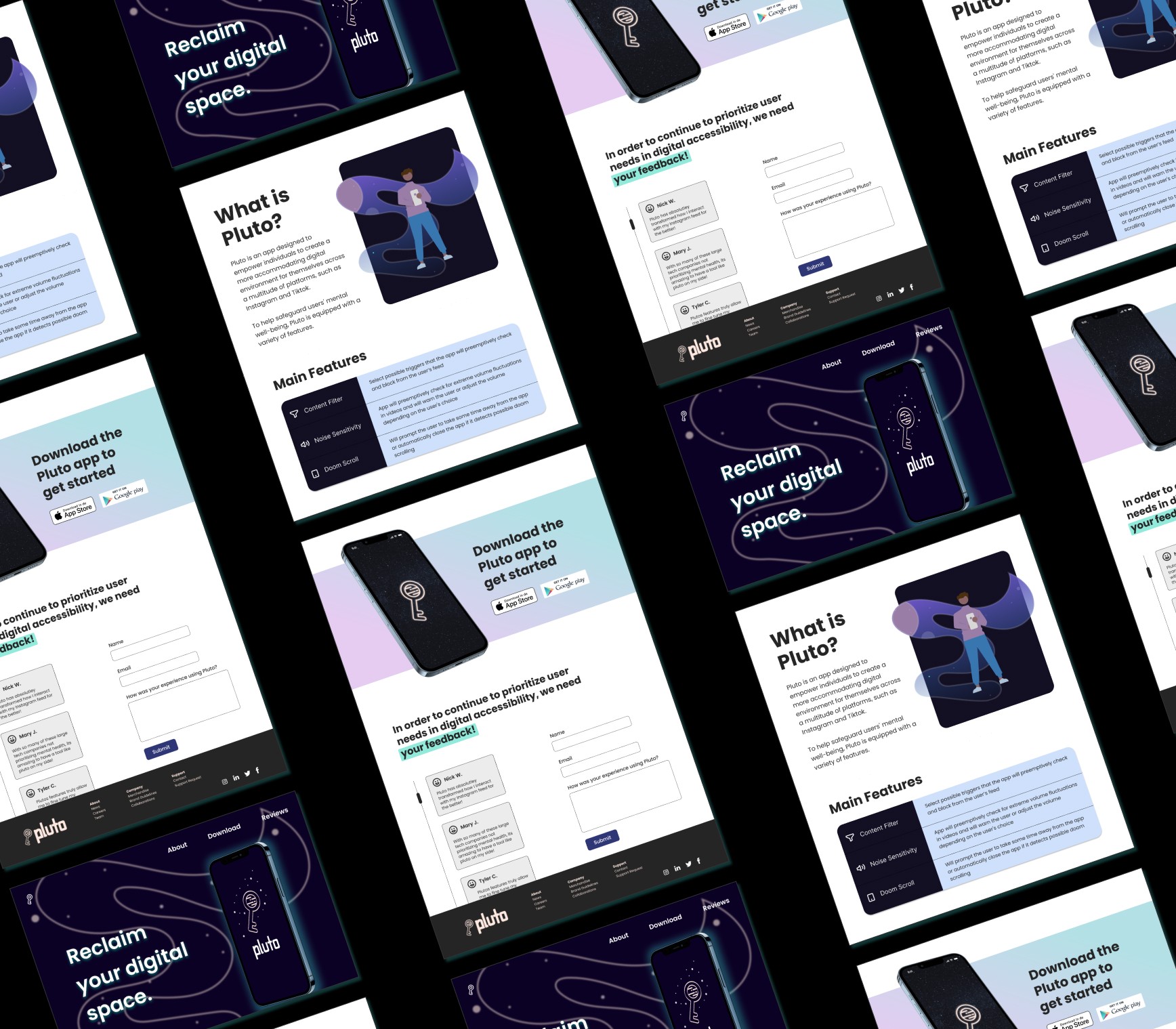
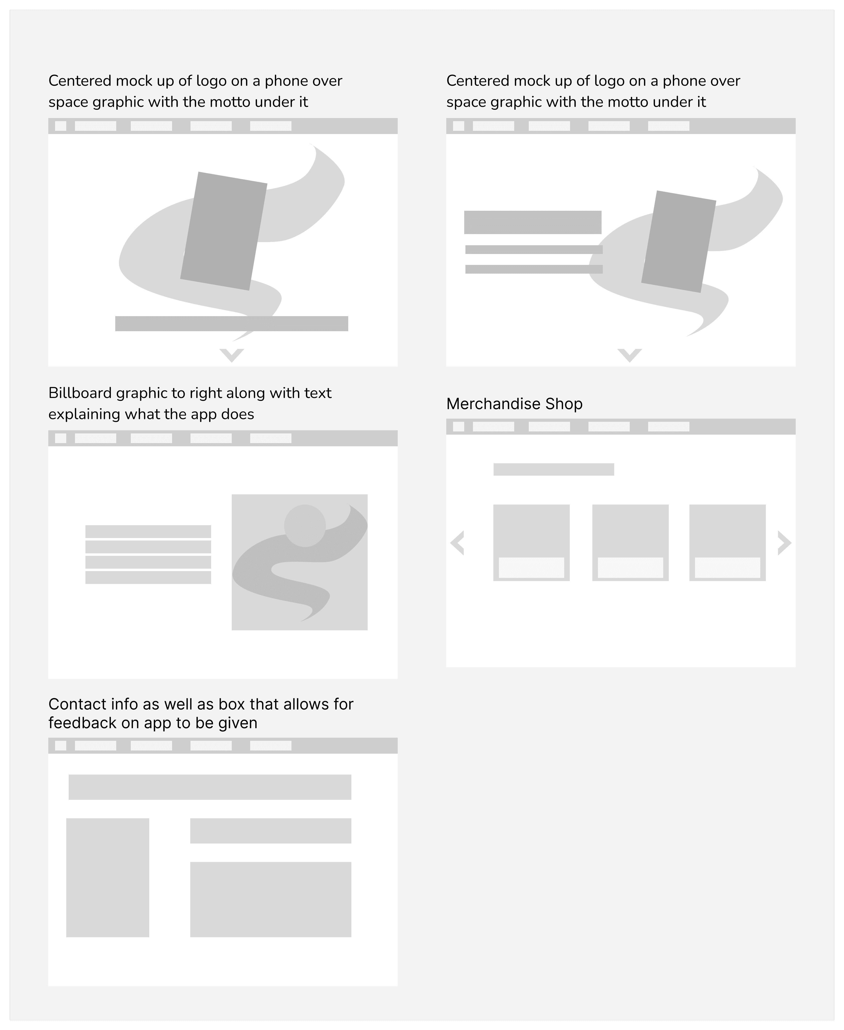
To create the landing page, my teammate and I both create low-fidelity mock-ups of our landing page, outlining the content our company might need showcased.
We split up the work and I specifically worked on the first three sections of the page: the initial screen users are greeted with, the about the app section, and the features section.
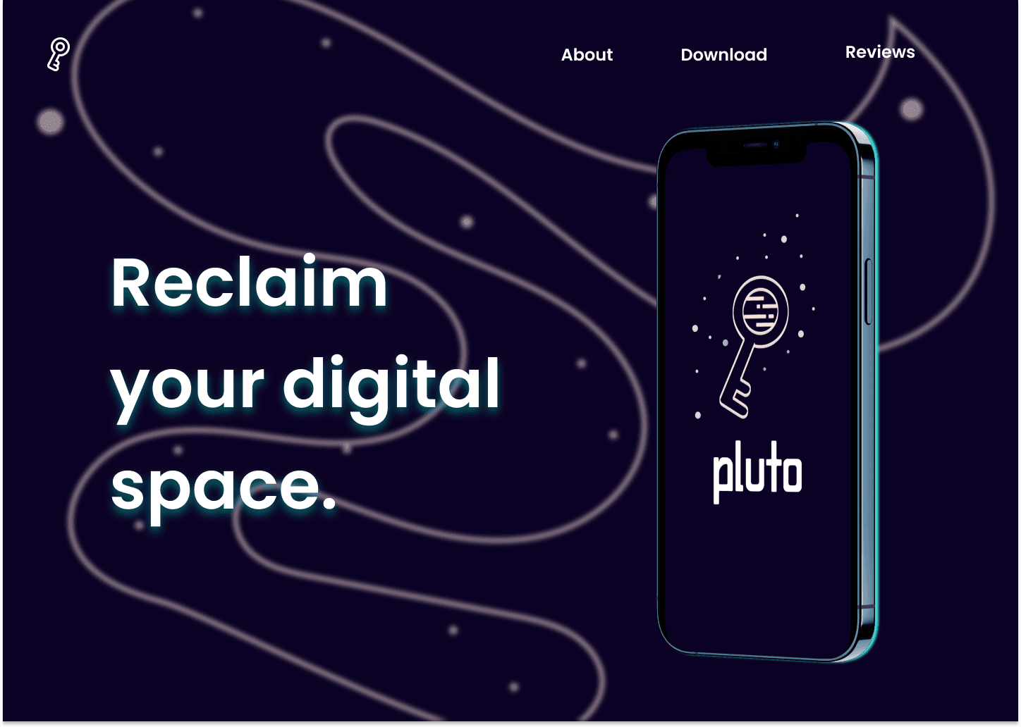
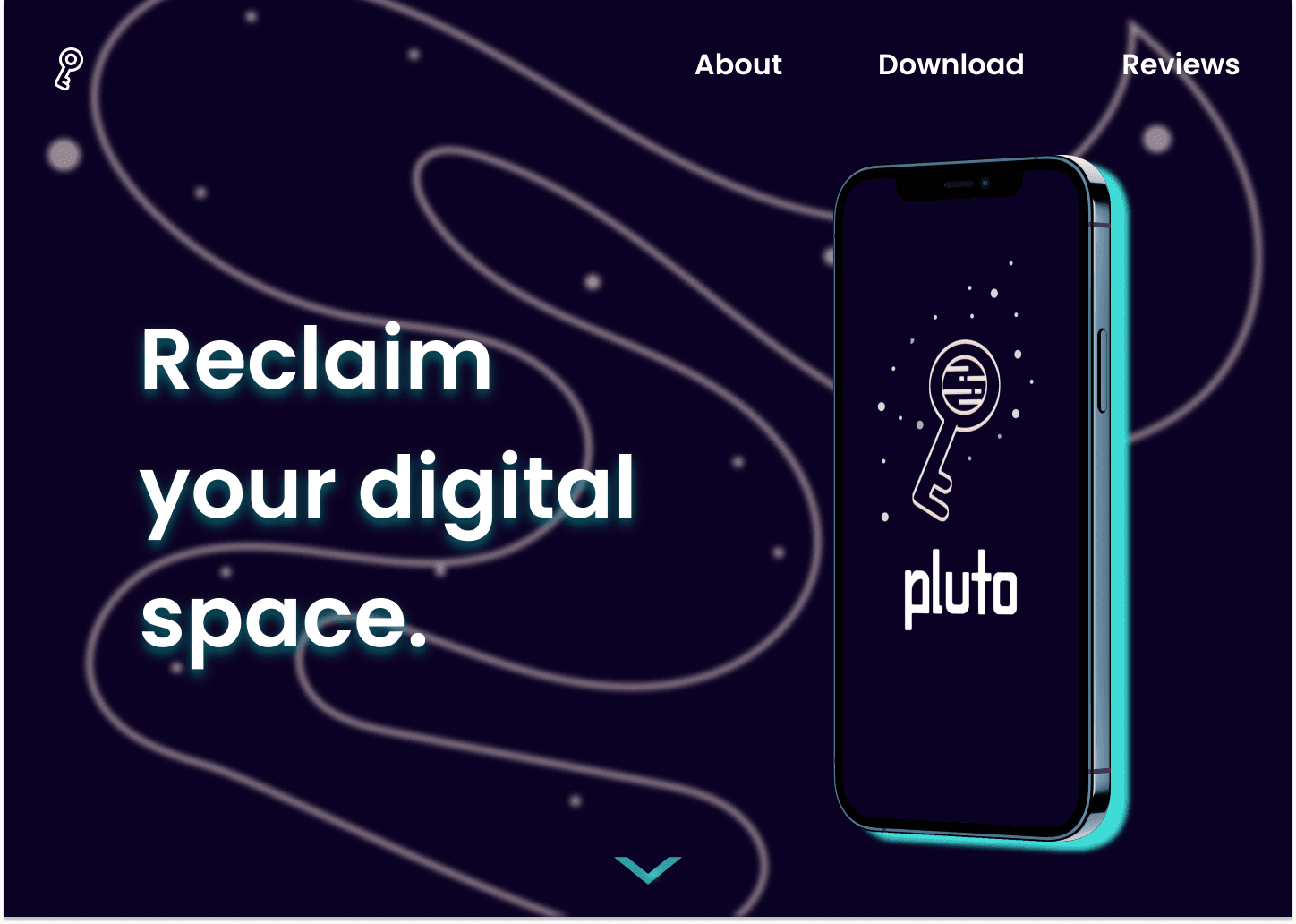
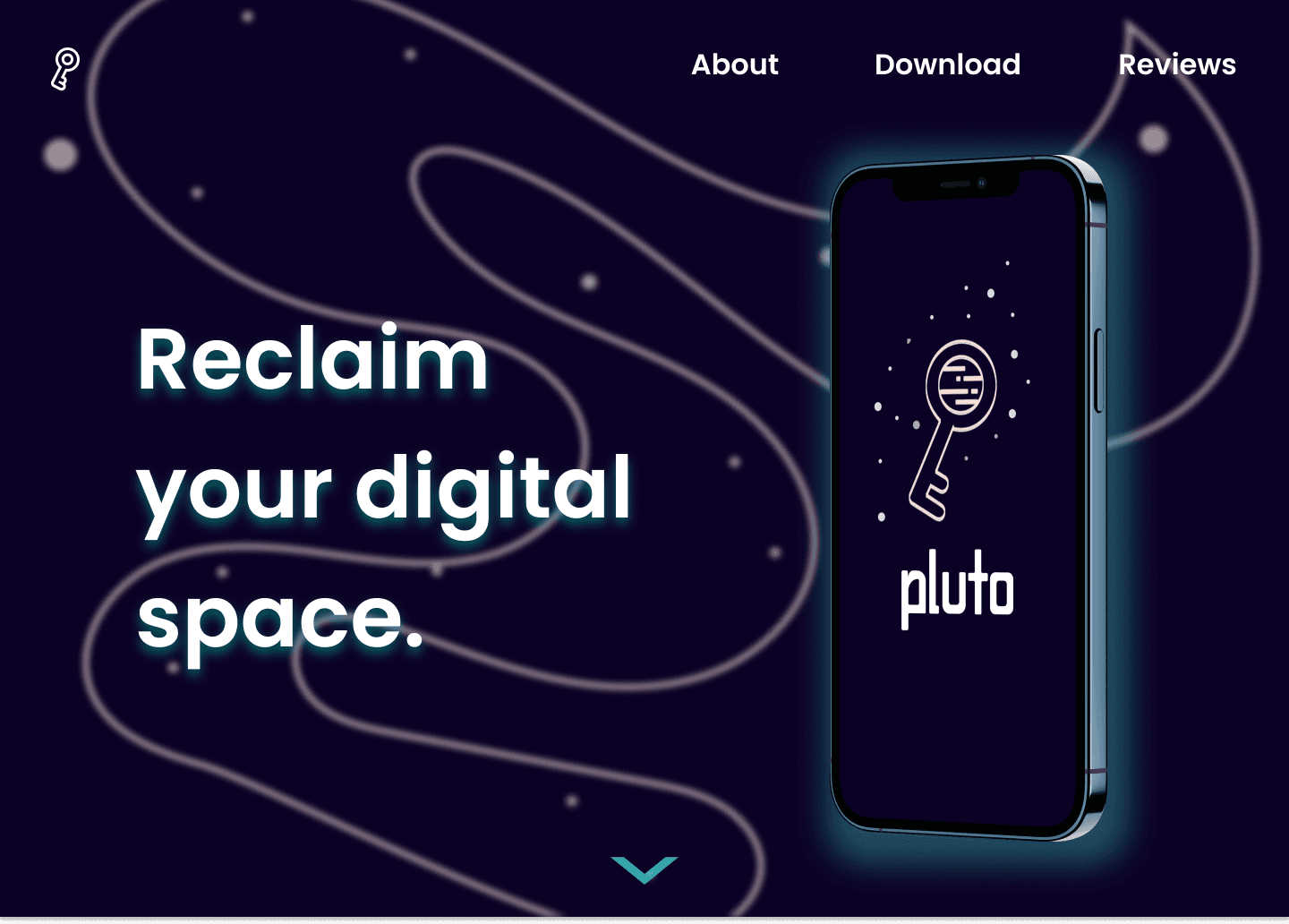
I wanted the initial landing page to have impact and create interest for potential users, hence my decision to create a large mockup of application's loading page with the backdrop being a large swooping figure that draws the eyes downward indicating that there is more information to see. When designing, I later placed a small arrow at the bottom of the page to further call the user to action, suggesting they should explore further down the page. I also increased the size of the navigation text and ensured the spacing between the text was consistent.
In the final iteration I addressed feedback regarding the harshness of the glow around the phone mockup.
Landing Page Final
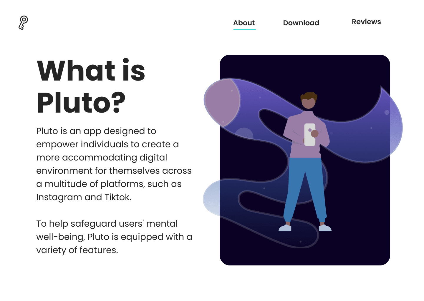
The next section would show some more of our graphic imagery, but with a focus of the text on the lefthand side. Rather than restating our mission statement, the text gives users more context about where this application is meant to be used. At the top right, the small bar in our accent color help orient viewers as to what section of the website they are on.
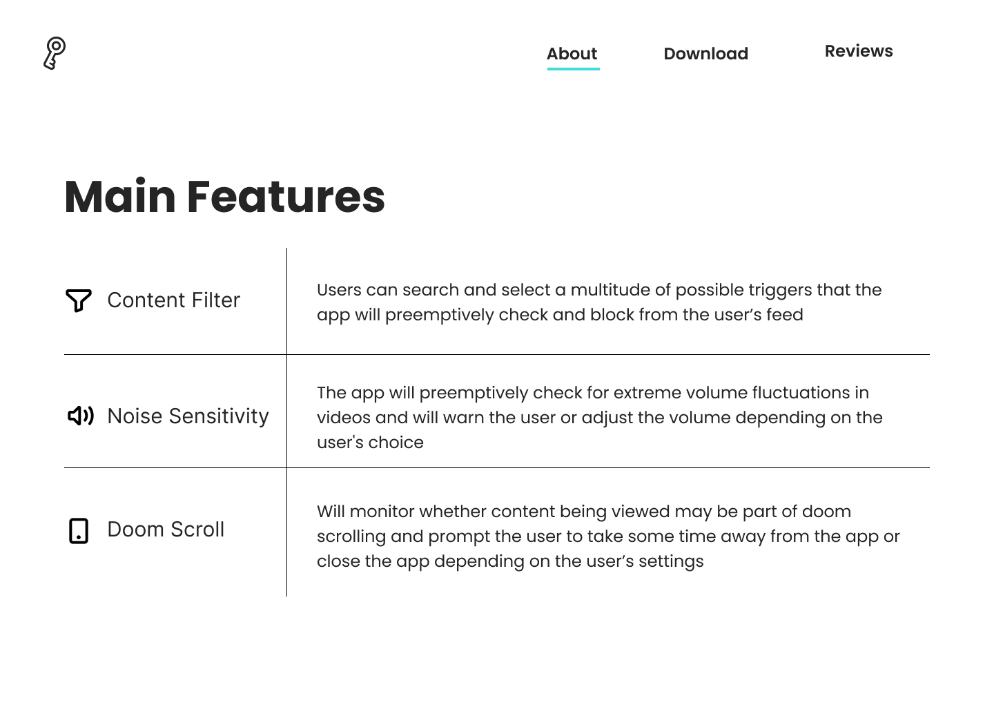
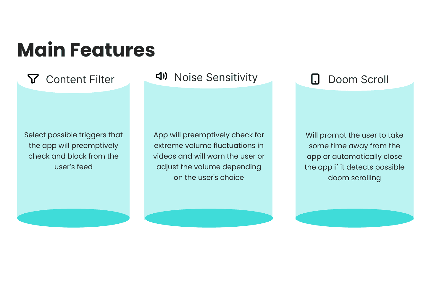
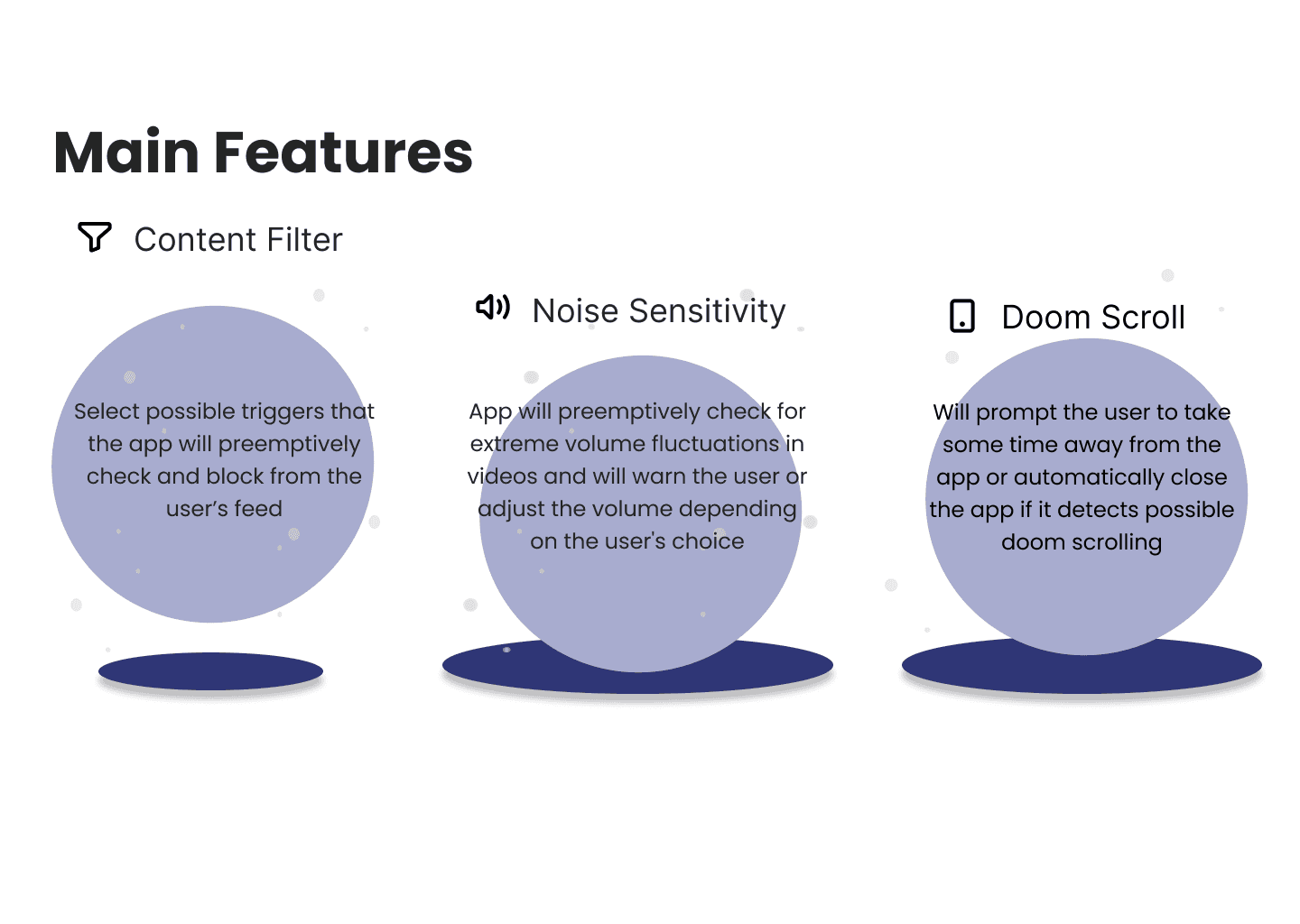
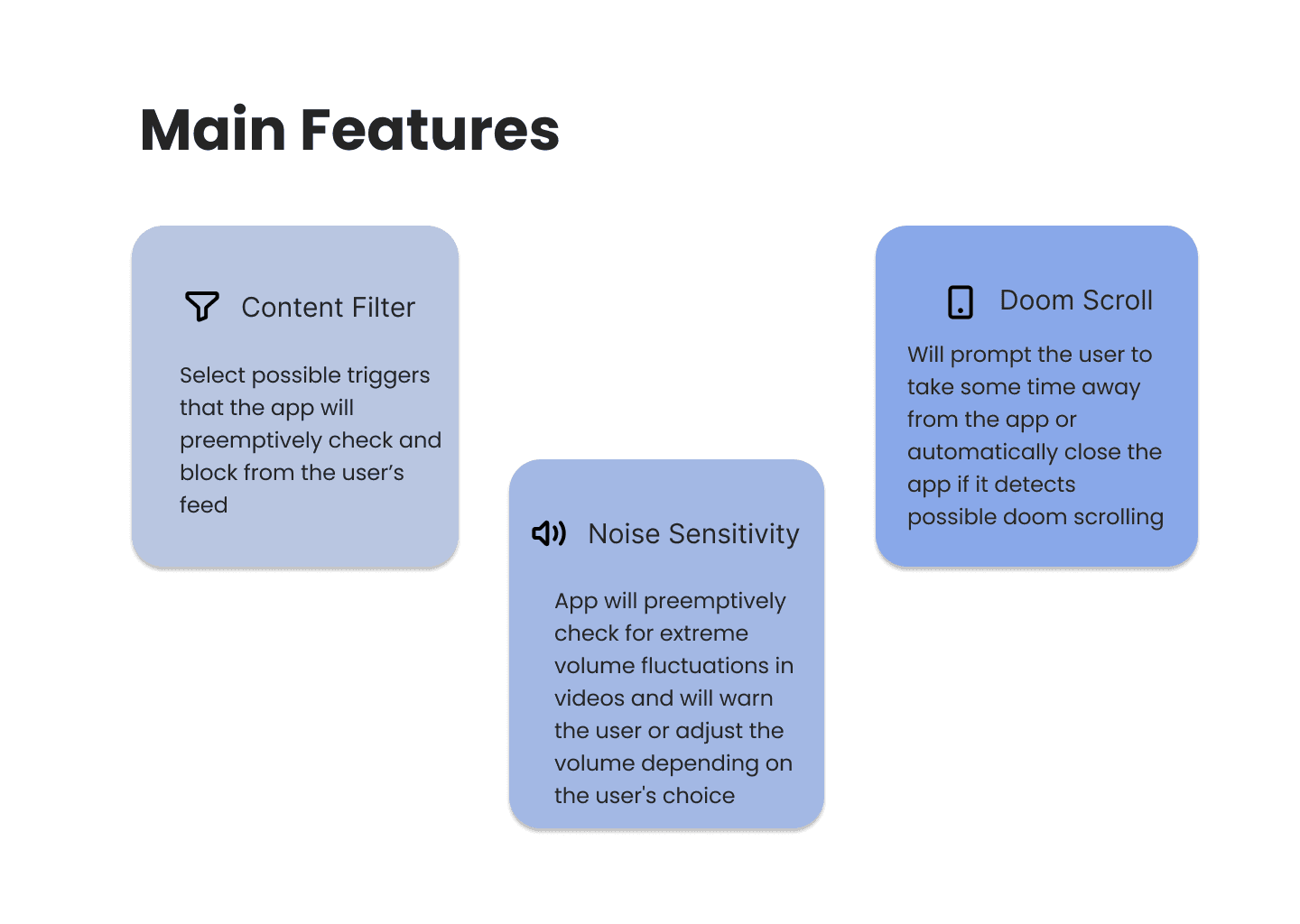
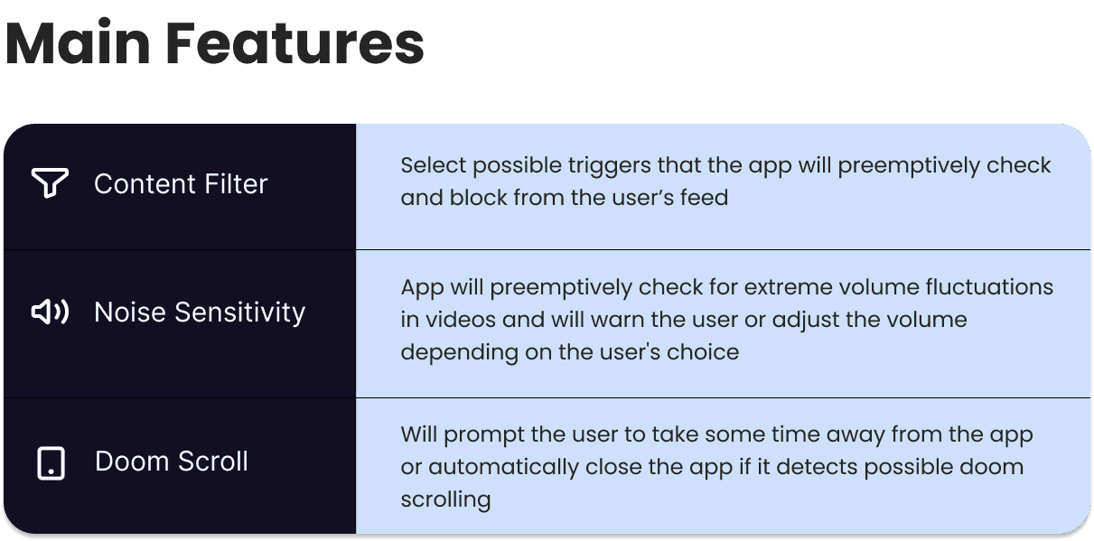
The final section was solely meant to give users more information on some our product's main features. The level of detail required more space, not leaving room nor need for graphics. The issue with the first iteration was the large amount of white space left. The page didn't feel cohesive with the rest of our brand as typically a good portion of the screen includes darker colored elements. I iterated through different ways of showing the information before deciding on the final version.
Main Features Section Final
Final Landing Page
All together, including my teammates contributions, this was our final landing page.
Merchandise
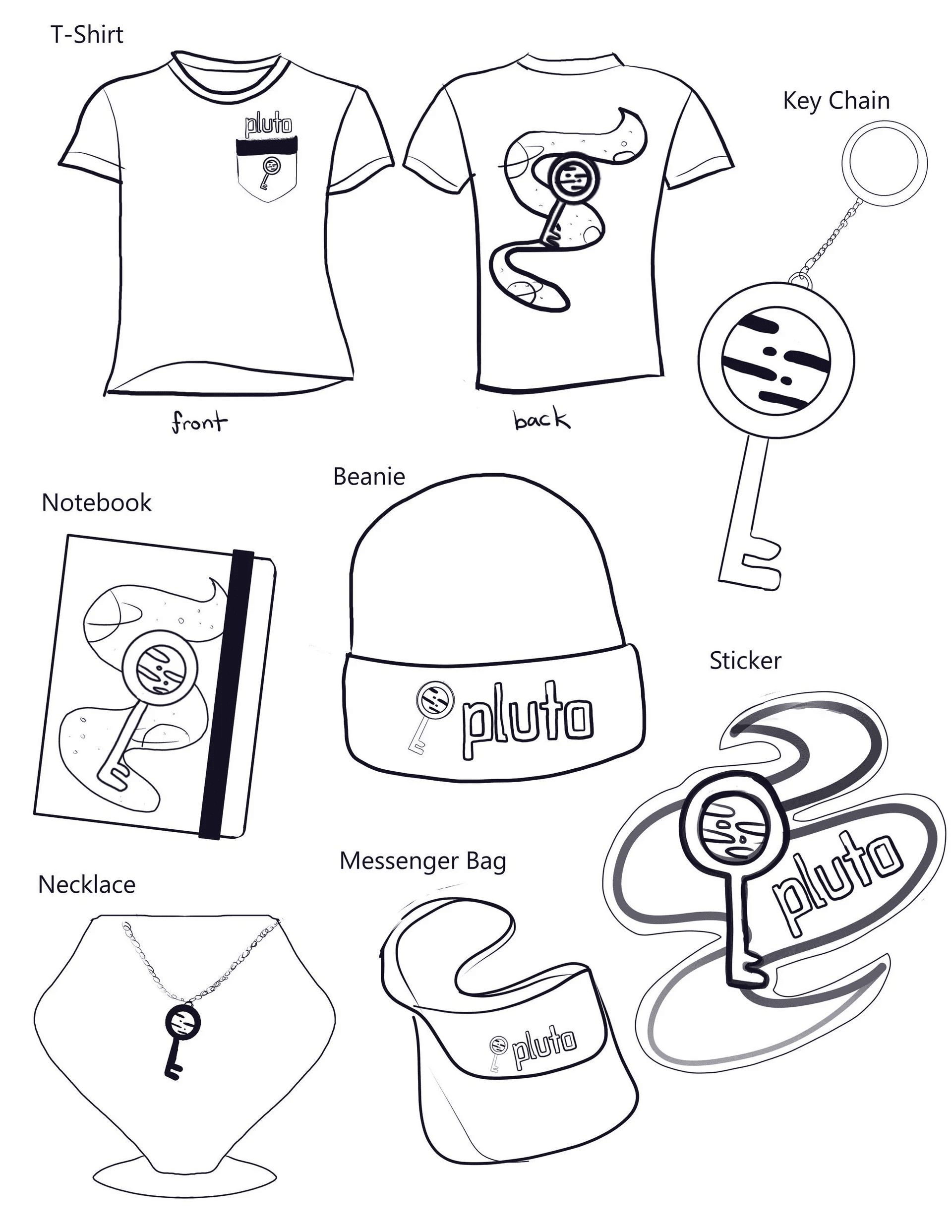
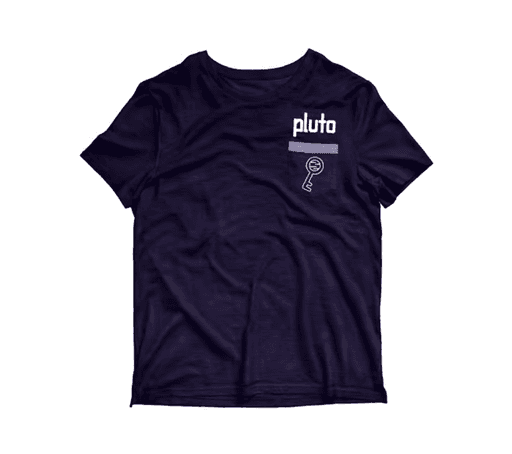
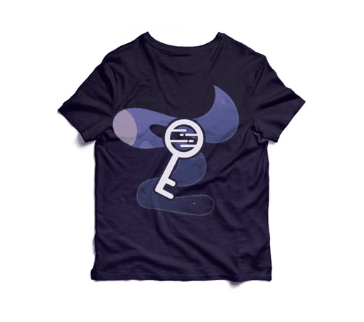
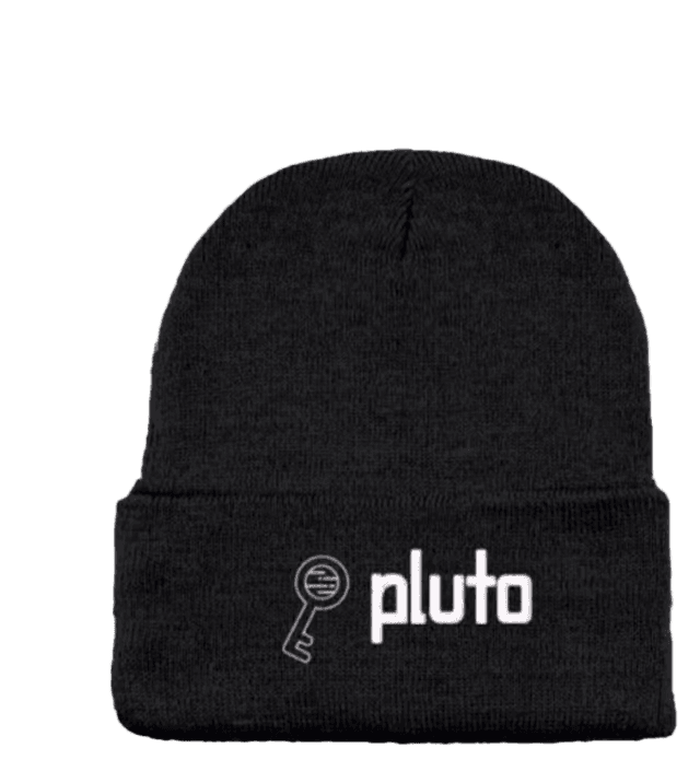
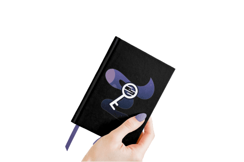
To create a more realistic and immersive brand, I then created mockups of a few of the designs using Photoshop. While articles of clothing are common merchandise for company's, we especially wanted to include the notebook as journaling is very helpful when dealing with mental health.

Complete Style Guide
After completing all of this, we compiled all of our work into a brand style guide.
Reflection
What I Learned:
Figma Features:
This project was my first introduction to Figma. I learned the basics of it from my design partner, and was able to ask for help from them and the internet when needed!
Collaborating On Multiple Deliverables:
Before this project I had never had to create cohesion across multiple deliverables with a partner. It was a great experience where I truly was able to both give and receive constructive feedback as well as trust in my partner's abilities. In addition, it was a great learning experience on how people with different workstyles can still collaborate as long as they maintain good communication.
A New Value of Iteration:
While iteration is already a huge part of my design process, I was still surprised to see how iterating could help in a retrospective way. The various iterations I created for our logo later helped me identify what was most important to the overall design as I created the final design.
Areas for Improvement:
Consistency:
Throughout our designs I can see a few areas where our colors deviated from our final brand identity guide's colors. While some of the colors are simply shades of our main colors, the difference is evident and should either be accounted for in the guide, or fixed.
User Research:
While not within the scope of this project, I would have like to conduct user research to get a better sense on what our users might want out of the product our speculative company is marketing. In a sense this was a passion project as the features are something that I have spent time thinking about and believe could truly help some users; experience when navigating social media platform, however only by conducting research could I truly begin to formulate a viable solution.
Final Thoughts
Overall, I'm really proud of the work my partner and I produced and feel I got to learn a lot from this project. It gave me a glimpse at some different aspects of design that I can't wait to further explore!
